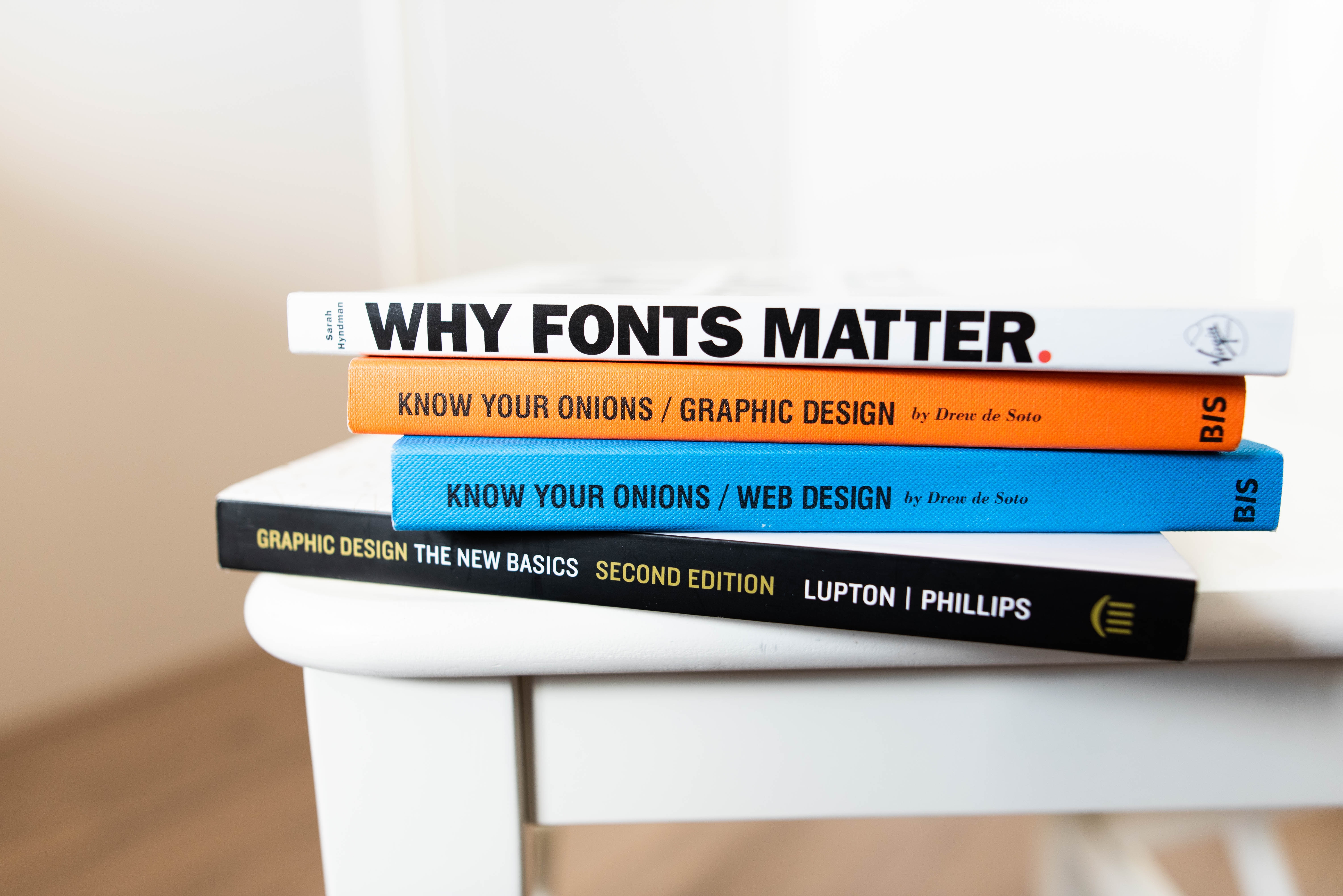
Fonts are an essential element in Graphic design. Fonts come in different styles which are used for the text and contents of the design. It can have a significant impact on the overall look of the design when the fonts are used correctly. With that said, below are some of our tips on how to make effective use of the fonts during your designing process.
Font alignment and placement
When placing the font on the design, it’s essential that they are aligned with the rest of your text. It prevents the font from looking messy. Aligned fonts also look more visually appealing and look well presented.
Font is readable
There are thousands of fonts design you can choose from. When selecting a style, ensure that it’s readable; otherwise, viewers won’t be able to read what the message is all about. Choose a style that stands out and works well with your overall design.
Split the text
Instead of using one block of text, you should split them into multiple boxes so you can customise each text. It is important to make each of your words stands out, especially if there’s a meaning behind the word. It’s also useful for making each word different from the rest of the text.
Create Contrast
Now the text is split, you should create a contrast to make the text stand out and more put together. Variations can be added simply by altering your fonts through size, spacing, bold, regular, italic, and so on.
Colour match
When it comes to choosing colours, make sure you use the right colours that work well with your background colour. For example, if your background is dark, using a light colour will make your text pop. If you have a white background, you should stay away from colours that are too transparent; otherwise, it will look faded and difficult to read.


